Wednesday, 13 December 2017

Ceramic 3D Print Designs


Ceramic 3D Print Designs

So the day we were supposed to start ceramic designs in groups of four, i made some quick sketches about ideas.

 Most of them are kinda just sketches and ideas, apparently Harrison told me I needed five, so I just put the five that I liked the most in here...


So we were discussing what object we should make, and Harrison was really enthusiastic about one of these ideas that he made. I felt like his object was nicely done, and of course I didn't even know if my objects were plausible, so I also put my green card in for his idea.

Kinda feels weird though. I'm not really used to not doing a lot of work in a group project. I guess it felt nice for a change to get carried for once.

3D Collaborative Hollow Form Project


        3D Collaborative Hollow Form Project

So w

hile I wait for the printer to finish being set up, I should probably finish this...


Im printing this out when the printer is finally ready (i should check today), basically its a fusion of one of my partner's pieces and something i designed on paper (i still dont have the technology to replicate that shit -.-)

The piece should be completely watertight, and ive designed it (i did a lot of the pointular stuff)
so that the corners don't fall off due to angular problems.


one of the problems we ran into was that some angles came off on too steep of a slope when we were nearly done, so I had to go backwards and change the angles so that the object was printable.


Two weeks ago, when we were supposed to do our mid-part process page, i took several pictures of our project, but apparently never wrote a mid-part blog, so i should definitely double down on this blog post.


 We combined these two (again I couldn't make the bloody piece because i missed out on some info...)

The picture on the left is actually from Jame's blog. My copy got destroyed in the process of making the final object because i was using Jame's object as the template.


 apparently his object had a lot of problems too, like how the cap wasnt really capped off, and the object wasnt entirely symmetrical. Because of this, if you look really carefully, you'll notice the final object isn't symmetrical either .-.

This picture to the right was the first concept generations page I made (I worked on the concept generation page alone because I felt like I shafted him by not having all ten prototypes ready on time...)
 This is the final draft piece that I made. The overall result was quite similar to final draft that I made, I guess I'm pretty happy in that regard.

We made several other ideas, like a star-shaped object, but Bryan thought that was too cliche of an object, so we went ahead with this piece. (nearly died in the process because neither of us were Harrison-leveled at Rhino...)


Update:

Printed successfully!


Well... almost successfully. To be honest, it didnt really matter that the top didn't quite make it, its a hollow form project, and I originally intended for it to be hollow anyways.


Tuesday, 14 November 2017

Quick update on the 3D Forms

Might as well get this across now.,.


I’m still working on my prototype forms for the 3D forms. I missed most of the class on Wednesday so there are still things I’m slightly confused about, but I’m getting them done through trial and error.


Most probably I’ll write a post about where I succeeded and failed when tackling a project with limited scopes.

Wednesday, 8 November 2017

Papercraft Designs: Final Form


Papercraft Designs: Final Form


Today I realized I can't stand papercraft.

That point aside, I think I did relatively well on my papercraft final project, which was the completed version of my root beer bottle.

Here it is now.
The Design is based off, again, the old root beer bottles of the 90's, although I also used designs from the present A&W root beer bottle. This is because although the teacher recommended I pull inspiration from the older root beer bottles to trigger a sense of nostalgia, I also wanted to bring, in a sense, my own source of nostalgia into the picture, being as the present A&W root beer bottle was the first and only bottle I've ever lived with.

 The most annoying part of the project, (other than me crashing on two hours of sleep in the evening and waking up at eleven the next day) was probably the fact that the bottle was a closed surface, so joining paper together became more difficult the more completed I was. 

At one point, it got so difficult to join the bottle (side) that I ended up having to cut through the top hexagon to get into the tabs. And of course afterwards, I couldn't put the hexagonal top back in, so I ended up just placing the tabs outside the bottle and covering them up with another layer of cardstock. (you can see this if you look closely at the top of my first picture.)

The final design of my object is to the right of the page. The red lines weren't actually included in the final object. (I had to use the tabs of the hexagon for the top though, because i couldn't put the top back in the bottle.  I wanted to bottle to be large so I split it into 6 pieces and printed them out using a similar template. That was the only reason why my bottle was around the same size as an actual bottle.


So Originally, My bottle template looked somewhat like this. We went over a layer of critiques in class that helped me shape it into the current object.

First of all, the teacher pointed out that instead of splitting the bottle down the middle, I should instead attempted to unroll the bottle from the sides. He explained that this would give more surface area to the paper I was playing with. Eventually, I decided that was still too small, so I employed my current strategy of the template.

Secondly, I was suggested to by my class that instead of making a 3D A&W logo, that I should print it out in 2D and paste it out as additional layers on the paper. I fully accepted their idea and even used the same concept for my "root beer" in the bottle.

Finally, the teacher recommended I cut paper bubbles out instead of drawing the designs out on paper. To a certain extent, I still feel like black marker would have given the object more content, but the current object is a nice twist to my traditional forms of making art.


This is the prototype design for my final design.


Wednesday, 25 October 2017

Papercraft Objects: First Phase


Papercraft Objects: Phase 1

So I'm finally nearly caught up to the rest of the class in terms of where we are at the moment, the digital sample objects is still nearly complete (because at this point, I've probably had enough half-grade deductions that that post of the week isn't going to be worth anything, so I might as well panick about homework that is still worth marks first.)

So the object I chose to prototype was the old root beer bottle, which I have a special place in my heart for being the first pop I've ever had. (I don't go 24 hours without a can of root beer at this point.) The teacher suggested the old root beer bottle instead of the newer pop can/bottle of the A&W brand that I'm more used to drinking, which, given the symbolism involved, I gladly accepted.

So since I was sick all week, (starting to get a lot better now, certainly able to work extended periods without nausea now) I nearly forgot all of the Rhino commands I learned from last week, which is why I'm finishing this blogpost at 2 in the morning. (Feels great when you forget you can make a curve parallel to the ground by holding shift eh?) 

So my rendition of the pop bottle is actually not bad, I managed to stick the entire A&W sign onto the bottle, and also split the sign down at the corner where the bottle is supposed to bend. I also simulated the cap and the bottom of the bottle, so it looks more realistic.

I managed to split the pop bottle into it's 2D components (which for previous reasons took ages to do). I finally managed to perfectly align all the sides by adding a rectangle to the base of the bottle (the bottle was slightly below the X plane) and using the perpendicular osnap function to align the shapes in a perfect 90 degrees.

I paid close detail to how the designs and the bottle were laid out. I found it pretty easy to lay it out in a formation where I wouldnt have to make repeated folds along a single line. 


The bottle and the labels spread outwards from the base of the piece, so I could have multiple paths of folding lines.

So I managed to complete the design, and then I rushed to school at like 11 to print it out, because thats when I was finally satisfied with the thing.


It turns out that  the pop bottle was a lot smaller than I expected it to be .-.
It's so small I couldn't graft the label on the bottle

I think I'll have to reprint it tomorrow on bigger paper...

The good thing is that I'm confident that the entire structure is going to hold out, so I wont be in the situation where the paper doesn't fit in with the form.

(Now I need to finish an essay and start working on my 30 inch self portrait... I guess that's what I get for losing my social health card...)


Wednesday, 11 October 2017

Remix Culture: Selection and Refinement


Remix Culture: Fini


I finally got my computer back! Yes! So now I had to select (which I already did) and refine (partially did that too) one of the mesh mashup pieces that I've presented on week 2. 

And the one I chose was my Tzaravak piece.


I actually went and re-fixed some areas that I didn't like, like the fact that the wings were in a super wonky position in my original screenshot, and the positioning of the body managed to confuse the hell out of some of my fellow students.

 I've attached a top view of the mesh in case people are still confused about it's anatomical structure, since that was the overriding concern my group had for this mesh in group reviews. Again, that is to be expected, because the mesh is supposed to look queer.

Actually, originally my group decided to vouch for my Cubone     T-rex mesh, but I really didn't like the balance of that piece and I didn't feel like I could make many adjustments to it so I decided to go with this mesh instead.


But What is Tzaravak anyways?

Tzaravak is the name I gave to the main antagonist in the story I'm writing, It's my favourite character (and I actually pay homage to it in a large portion of my major art pieces) because of the philosophy revolving around the concept and name of the character. Tzaravak is derived from the latin word "tzaravash", which roughly translates to "evil" in english. Hence the creature refers to itself as the "God of Evil" throughout the story. 

Original renditions of Tzaravak that I've made

This name is actually dramatically ironic, (and here's the spoilers to my nonexistent book) since there really can't be a definitive method to measuring what "evil" is throughout the story. The entire lore confronts the concept of what true justice is, and how there really isn't a correct side when it comes to conflict. What's more ironic is when your so called heroes finally do kill Tzaravak, the action of the killing ends up triggering the destruction of the universe. 

(spoilers for my nonexistent book end here)

So I actually originally designed Tzaravak with the "remix" concept in mind, except instead of mixing other people's artwork, I was remixing creature parts. Because I wanted the creepy/unknown effect (people fear the unknown and as such view it as a threat to themselves) I mixed a Ram skull onto a dragon body, with a centipede's body from the waist down, and mantid-like forearms. I figured the centipede body would have given a creepy feeling while the dragon and mantis parts would make it look menacing. The ram skull is predominantly a symbol of death, so that is what I chose for the head. That was the concept I came up with four                         years ago.


Therefore, I thought it would be greatly interesting if I ran it for my mesh mashup project because I still remember me mixing and remixing ideas and concepts around to create the character when I first began the piece, because back then I had inadvertently dipped into remix culture already.


Tuesday, 10 October 2017

Papercraft Introduction


Papercraft Introduction


This week I was re-introduced to the concept of paper-craft as a form of art. Paper-craft is the creation of two or three dimensional artwork using cut paper as the primary of only medium of the artwork. 

Generally, people who have not extensively studied this field of art will think about origami when asked to consider what paper-craft is, and I was certainly no exception. Therefore, I was incredibly impressed by Cybèle Young, a world-renowned artist who uses paper-craft as her primary medium. Cybèle has published several books with illustrations made with paper, as well as having shown work at galleries around the world, like New York or Japan. 

                        Cybèle's work seems to revolve around the concept of change, which is seemingly paradoxical theme for a art form such as paper, being such a difficult and fragile material to handle. She makes use of everyday objects, slowly abstractifying and then redefining the object into an entirely separate entity. In her own words, "Engaging with abstract and familiar motifs, I juxtapose sculptures to create a sense of dialogue of play between them." She's done this with several objects, changing a violin case into a Starfish, an umbrella into a jellyfish, and even earphones into a caterpillar. 


The 'finished' product is always some organic form or mass as well. Some of her transformations don't always take on a species of animal or plant, sometimes the form is completely abstractified into an unrecognizable state, yet still seemingly organic. And when Cybèle does create structural shapes and everyday objects, they look frighteningly like the real thing. It is almost as if the paper could be a substitute towards the actual object.

The blogpost on Cybèle caught my attention immediately, since I tend to be drawn to any imaginative creatures or monstrosities that artists can conjure up. Originally I was slightly disappointed that I wasn't going to be seeing any weird Lovecraftian creatures in the blogpost, but I was really captivated by the detail and depiction of creatures that aren't often seen in your standard art gallery. The sculptures that were intended to be seen as another creature had a sense of life in them, as if one could imagine them as an actual creature if you weren't looking properly.

Going through her website I was astounded to discover the variety of art forms Cybèle had worked on, ranging from lanterns to small mills, all the while keeping her original theme of "forming new relationships". In this age where art is able to take so many different forms, I find Cybèle is able to hold onto the core ideals of her sculptures, and is one of the few 'sincere' artists in the valley of artists I find are more and more focused on making money with their pieces rather than genuine art. It gave me breath of fresh air, and a sense of optimism about the direction that the art industry was headed towards. 


Update on Last week: 

Just to let everyone know, I finally managed to get my computer back early Sunday evening, and I really wanted to make some parts better, so I will upload it by the end of today.*

*right, i can't download rhino... Guess i'll finish the blog and the piece and put the pics on tommorow...

Tuesday, 3 October 2017

Computer Broke Down

Computer Taken in for repairs


This past week, we were requested to completely render and show one of our remix culture pieces from last week in a completed form. 

My computer was taken in for repairs on Sunday after it unexpectedly crashed and could no longer start up on Saturday evening, and I had most of my homework done on it, the piece I was rendering and fixing on Meshmixer was my “Tzaravak” Piece. It was around 70 percent complete. 

I decided to make this post because I recalled the teacher pointing out that if a student could not finish a blogpost, they should point it out in their blogpost, along with the reasons for such failure to complete the project. 

I’m not sure when I’ll get my computer back, as the problem is apparently worse than the initial diagnosis (reported to me on Monday by the Genius Bar) but when I get my computer back I’ll be finishing and updating the blogpost.

Tuesday, 26 September 2017

Remix Culture


Remix Culture


We were introduced to the concept of remix culture this past week, a concept that I was relatively
familiar with, but was excited to check out nonetheless.

The concept of remix culture as I understand it, is a culture that follows the dogma of "nothing under the sun is new". It gives artists the opportunity to re-design a concept without changing the inherent value of that concept to begin with. The fact that one can be allowed to add onto a structure without changing it's original form is significant, because it demonstrates the capability for human beings to grow or change, or even to show adoration or contempt for something that already exists.


In order to demonstrate our understanding of remix culture, we were assigned to creating ten "remixed objects from the 3D object publishing site, "Thingiverse", which allows people to download published objects and "remix it" to add value to it.

The first object I designed was an "Realistic Cubone" from the popular Cartoon "Pokemon". Basically, Cubone is a dinosaur looking creature with a giant skull on it's head, which I've replicated using a tyrannosaurus body and a ram skull. I chose a T-rex and a ram skull because I thought they would make a pretty aesthetically pleasing pair, although the ram head ended up a tad too large because or it's shape.

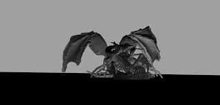
 Remix number two is called "Western Dragon", which is a slightly dramatically ironic name. This remix calls back to the ancient Chinese belief that they were the center of universe because they believed that dragons could not exist too far from China. This is because they depicted the Chinese Dragon having five claws in China, four in Korea, and three in Japan, which is a bit farther from China in relationship to Korea. So the Chinese naturally assumed that if dragons stray far enough from Asia they end up losing all their fingers. I chose the snake body with the dragon head because that is what asian dragons supposedly were made of, snake body, eagle's talons, and deer horns. The chicken legs were added for comedical effect.

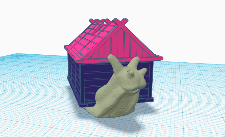
The third remix came to me as an idea for a snail having an actual house on it's back. I was originally going to use a turtle, but I really didn't like any of the turtle designs on Thingiverse, so I ended up going with the snail.

Again, I chose the snail because the turtles just weren't as good, and I specifically chose this house because its bottom and room were detached from the house for it's block parts, so I found it very easy to keep the bottom of the snail visible while putting the house on it's back.

I continued with the wordplay on remix number four with the Dragon Millipede(Centipede). So yes I used a centipede model for the dragon millipede, but the only millipede I saw on Thingiverse was going to be too large for Tinkercad, and at this point Meshmaker had actually crashed my laptop once, so I decided to play safe and run with the centipede diagram.

Why Dragon Centipede? Well because I ran a study on it in grade nine and really like the animal, so I still remember it. The other choice was the Inland Taipan, but I couldn't think of any wordplay with that name.


Remix number five was inspired by a biblical verse that I happened to come by on Sunday.

It reads, "Do not be decieved, God is not mocked; for whatever a man sows, this also he will reap."-Galatians 6:7

So the thing a tree that grows garbage cans as it's fruit, because humans really like to just put garbage everywhere. So that's my response to that verse.

On a much lighter note, remix six was an inverted mermaid; still half fish and half human, but as one can tell, the head to body diagram doesn't look like a regular human...

This human body was actually really nice, because of the low polygon count, so I didn't have to do much tinkering with it. At this point I really didn't want to deal with mesh maker, because of the previous crash situation.


I called the seventh remix "Definitely a T-rex". It looks really silly because it was partially a screwup between me trying to create a t-rex/human hybrid, but I guess it got my original idea through better than the original mesh.

I wanted to make a mesh of some dinosaur and human for comedical effect, and also because I find that humans make every other creature on the earth to be like themselves, so in essence we force our ideas upon other animals (how many of you dress your dogs?)


The Eight remix is a cross between a pig and a cow. I edited the mesh to make it as fat as possible, going back on the meddling with nature theme. I also added a giant udder to the cow to show that the modern cow has essentially become a food/milk dispenser. I think the pig demonstrates this pretty darn well, because it is a symbol of gluttony. Interestingly, the shadow of the mixed mesh has the head still looking like a cow; I noticed this when taking the screen shot, so I zoomed out to include the shadow.


I went back to "Fat'n Depressing for the ninth remix. I mixed a cat with a skull, along with a bunch of pizzas, but to be honest, I could have chosen anything to be the base, I just settled with the cat because it made the mesh look cute.

Originally I was going to use a fat face for the head, but because the cat itself was already so fate I thought it would be interesting to juxtapose a skull instead of the human face.

The last mesh was my all-in-do-it-try-hard mesh. It's a 3D rendering of a character I designed named Tzaravak. I used a combination of the ram skull, elongated t-rex jaw, as well as wings from a dragon and centipede body to make it, topping it off with a skeleton. I'd say it was pretty neat, and its a pretty cool testament to remix culture.


These are the links to each of the objects that I used for remixing. They were all found on www.thingiverse.com

ram cubone
https://www.thingiverse.com/thing:473590
https://www.thingiverse.com/thing:624615

Western Dragon
https://www.thingiverse.com/thing:1372964
https://www.thingiverse.com/thing:547968
https://www.thingiverse.com/thing:182377


snail house
https://www.thingiverse.com/thing:88464/#files
https://www.thingiverse.com/thing:1700233


Dragon Millipede
https://www.thingiverse.com/thing:328253/#files
https://www.thingiverse.com/thing:182096

You reap What you Sow
https://www.thingiverse.com/thing:621711/#files
https://www.thingiverse.com/thing:845449/#files

mermaid?
https://www.thingiverse.com/thing:1095845/#files
https://www.thingiverse.com/thing:1008753/#files

Obviously a T-Rex
https://www.thingiverse.com/thing:308335/#files
https://www.thingiverse.com/thing:1528540/#files
https://www.thingiverse.com/thing:330220/#files

Gluttony
https://www.thingiverse.com/thing:224314/#files
https://www.thingiverse.com/thing:182114/#files

Fat'n Depressing
https://www.thingiverse.com/thing:967868/#files
https://www.thingiverse.com/thing:445805/#files
https://www.thingiverse.com/thing:518109/#files

Tzaravak
https://www.thingiverse.com/thing:1224280/#files
https://www.thingiverse.com/thing:1465430/#files
https://www.thingiverse.com/thing:278633/#files
https://www.thingiverse.com/thing:1086833
https://www.thingiverse.com/thing:1726984
https://www.thingiverse.com/thing:308335
https://www.thingiverse.com/thing:182096

Tuesday, 19 September 2017

Good Design is Innovative


"At the end of the day, and you're looking around at the objects around in your house, and you're deciding 'What really has value here', it's going to be the objects that have some meaning in your life." -Rob Walker


         Watching the feature-length documentary "Objectified', I was drawn towards Rob Walker's speech near the end of the documentary. Throughout the duration of my second viewing, I really couldn't help but ask myself, "What would I grab first when the Hurricane is coming?" Looking at my phone, my first thought was that I would probably grab that on a whim: after all, the modern phone has been the most value to the modern individual. Thinking through the question again though, my eyes drifted onto the pen on my desk, right on the other side of my phone.


          How important is a pen to it's artist?


For me, surely, it must have the greatest value of all the objects that one can perceive, for it is the identity of the artist. Interestingly, throughout the entire duration of the documentary, the pen only appears once, which is at 55:23, when the lady is observing a pen in a store.

This was the thought that pierced my mind when I decided that the object I was going to design would be a pen.

The overall idea of the pen i designed was that the pen was supposed to relieve strain on the hand when pushing on the ink. This was an idea I pulled from the documentary when Dan Formosa is talking about the design of a peeler for people with arthritis.

Pens are sometimes really annoying to deal with, the actual pen is held from the front, near the tip, but the button that pushes the pen out is all the way at the back, or as a lid on the cap that has to be removed and put in a safe area so it doesn't get lost. Similar to the potato peeler case, that can become really dawdling to some people.


The concept behind my pen is that applying pressure to the rings when your fingers slip into them will cause ink to naturally flow out, which removes the requirement to open the pen from one side or the other. You can just grab the pen and push, and you can start working.

In the documentary, Dieter Rams notes that
"Good design is innovative." I feel like that is the crux of design fundamentals, and that was the overall concept I followed when making my design.